LYFETYMES - Party planning for everyone.

Context
I was tasked with redesigning the landing page of Lyfetymes (a party planning website) in one week sprint.
Problem
The existing landing page has a lot of great tools/information for planning any celebration, such as templates, evites options, vendors and reviews to lend credibility, but the way all of this is laid out seems overwhelming. They need a UX designer to improve information architecture, visual hierarchy and visual design.
Solution
A strategic planning of content to improve information architecture, visual hierarchy and design to deliver a delightful experience.
My Role Team Tool Timeline
UX Designer Individual project Figma 1 weeks
Process
Research
I began my research with a swot analysis of the current landing page to gain insight into the strengths and opportunities for improvement of the landing page. I performed competitor analysis, explored UI elements and studied marketing strategy for landing page design.

Competitive analysis
Evite has a fun and clean website
It gives a glimpse of what to expect but it doesn’t overwhelm the user.
It has better contrast in the navigation bar leading to better legibility

UI Audits
Having a card carousel is a great way to present many options without overwhelming the user.
Lower opacity of the cards give more interest and lightness to the image which adds to a pleasant experience.
Concept : Early Sketch and Wireframe

Design :
Design system

01. Improved visual hierarchy and contrast
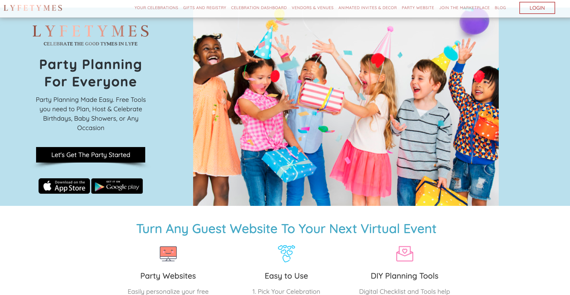
BEFORE
Lack of visual hierarchy and low contrast in the navigation bar.
Multiple buttons - not directing the user to a call to action

AFTER
Improved visual hierarchy and increased readability of the navigation bar.
One button- Primary call to action
02. Decreased decision fatigue via information architecture

BEFORE
Too many choices at once leading overwhelming and distracting.

AFTER
Improved organization of features and categories of celebration. Carousel of cards allows three option at any time, giving the website a clean feel and decreased decision fatigue.
03. Highlighting reviews

BEFORE
Lacks legibility. Not readily recognizable as customer feedback. It doesn’t make a strong impact.

AFTER
Makes an impact with the number of reviews. Including the number of stars gives the user an idea about the review even before reading it. Increase legibility
User Feedback
I received feedback from 12 participants to understand what worked and what could be improved in the design of this landing page.


Outcome

Results
Enhanced usability and learnability via redesigning information architecture and visual design
Improved accessibility by increasing contrast and visual hierarchy
Enhanced impact of the social proof